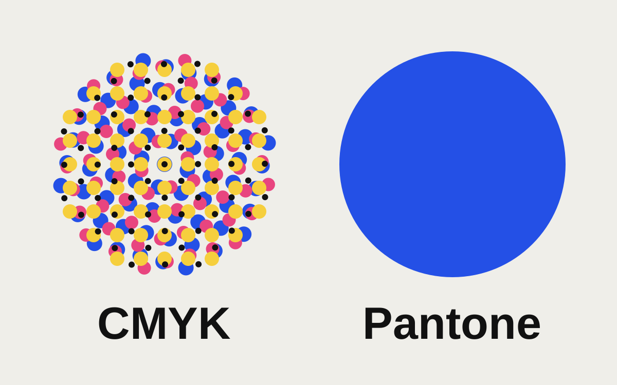
Most brands need both. A Pantone color is a specific premixed ink, so it prints the same shade every time on any press that runs it; it's the right choice for logos on one- or two-color jobs, packaging, merchandise and anything that must match exactly across suppliers. CMYK builds color from dots of four inks, which is how almost all full-color printing works, including most digital presses. Your brand guide should list a Pantone reference and a CMYK build for each color, and accept that the CMYK version of some Pantones will only ever be close.
The difference in one paragraph each
CMYK (process color) prints cyan, magenta, yellow and black as tiny dots in varying amounts. Your eye blends them into a color. Every color on the page, from skin tones to a logo, comes from the same four inks, which is why full-color printing is efficient. The trade-off is that the result depends on the press, the paper and the settings, so the same CMYK numbers can look slightly different from one printer to the next.
Pantone (spot color) is a numbered ink from the Pantone Matching System, mixed to a recipe before it goes on press and printed as a solid layer. PMS 286 C is the same blue whether it's printed in Ohio or Ontario, within the tolerance of the ink and paper. Each spot color needs its own plate or screen, so it adds cost on a press that's already running CMYK.
Some colors can't be made from CMYK
CMYK covers a large range of colors, but not all of them. Pantone's library includes many that sit outside it:
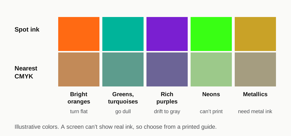
- Bright oranges and vivid reds-oranges, which turn brownish or flat in CMYK
- Saturated greens and turquoises, which go dull
- Rich purples and violets, which drift toward blue or gray
- Neons, which can't be printed with CMYK at all
- Metallics (the 8000 and 10000 series), which need metallic ink
If your brand color is one of these, the CMYK build will be the nearest achievable color, not a match. That's not a printer error, and no setting will fix it. It's worth knowing before a client sees a CMYK proof next to a Pantone chip.
The reverse is also true: many CMYK colors have no exact Pantone equivalent. Pantone publishes CMYK values for each of its colors in its Color Bridge guide. Those are a good starting point, but your printer may tune them to their own press.
C, U and why the same Pantone looks different
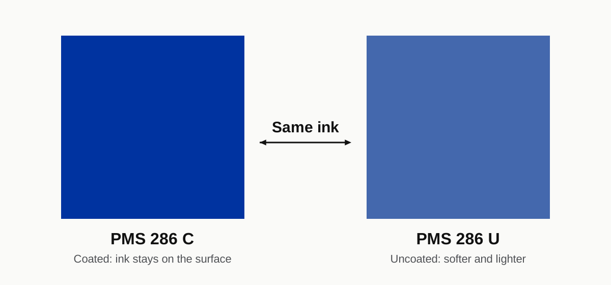
Every Pantone number comes in versions for different papers, most commonly C (coated) and U (uncoated). It's the same ink in both, but uncoated paper absorbs more of it, so PMS 286 U looks softer and lighter than PMS 286 C. A brand printing letterhead on uncoated stock and brochures on gloss should expect the two to look slightly different, and should judge each against the right swatch book.
Which jobs use which
| Job | Usually printed as | Why |
|---|---|---|
| Full-color flyers, brochures, menus | CMYK | Photos need four-color; adding spot plates costs extra |
| Business cards on a digital press | CMYK | Most digital presses only run four colors |
| One- or two-color letterhead and envelopes | Pantone | Two spot inks are cheaper than four, and match exactly |
| Packaging and labels | Often both | CMYK for imagery, a Pantone for the brand color that must match across runs |
| Screen-printed apparel | Spot (Pantone references) | Each color is its own ink and screen anyway |
| Promotional products, pens, mugs | Pantone | Suppliers mix ink to the reference |
| Signs and banners (wide-format inkjet) | CMYK, matched to a Pantone target | The printer approximates the Pantone with its own inks |
| Vinyl lettering | Vinyl color chart | You pick the closest film color, not an ink |
The decision isn't always yours. A digital press that only runs CMYK will convert any Pantone in the file, which is why printers sometimes ask you to do it yourself first. That situation has its own page: convert the spot colors to CMYK.
How to write a brand color spec
For each brand color, list five values:
- Pantone C, for coated stock and as the master reference
- Pantone U, for uncoated stock (some brands pick a different U number that looks closer to their C)
- CMYK, the build to use for four-color printing
- RGB, for screens
- HEX, the RGB value as a web code
Add a sentence saying which one wins if they disagree. For most brands, that's the Pantone C.
When a brand starts on screen (with a HEX code from a website, say), the order runs the other way: pick the Pantone that best matches the intended color in print, then derive CMYK from it, rather than converting the HEX straight to CMYK with software defaults. Screen colors converted directly tend to come out dull, as our RGB to CMYK page explains.
Choose with a physical guide, not a screen
A monitor can't show you what an ink looks like on paper. Choose and approve Pantone colors from a printed Pantone guide under daylight-balanced light, and approve CMYK builds from a printed proof from the press that will run the job. If you don't own a guide, most printers will show you theirs.
Getting color to match across suppliers
Brands usually notice color problems when two printed things sit side by side: this year's boxes next to last year's, a sign next to a business card. A few habits help:
- Send the same spec to every supplier, with the Pantone reference stated, not just the CMYK numbers.
- Ask for the brand color to run as a spot on long packaging runs where it's affordable.
- Keep a printed reference. A good sheet from a previous run is something the next printer can match to.
- Expect wide-format and textiles to differ. Banners, wraps and fabric use different inks and materials. Ask for a strike-off or test print on the actual material.
Where logo files come in
None of this works if the logo itself is a JPG with colors picked from a screenshot. Colors in a raster file are whatever the pixels happen to be, often slightly different in every copy. A properly built logo file has its brand colors defined as swatches, with spot versions for Pantone jobs and process versions for CMYK work.
That's part of what our logo redraw service delivers: a $25 hand-drawn vector with colors set in CMYK, RGB and HEX, and Pantone matches where you need them.
FAQ
Is Pantone more accurate than CMYK?
It's more consistent. A Pantone ink is mixed to a fixed recipe, so it looks the same from job to job on the same kind of paper. A CMYK color is built on press from four inks, so it varies more with the press, paper and settings. Both can look correct; Pantone is easier to repeat exactly.
Can every Pantone color be printed in CMYK?
No. Many bright oranges, greens, purples, all neons and all metallics fall outside what CMYK can reproduce. The CMYK version will be the closest possible color, which can be noticeably duller. If an exact match matters, print that color as a spot ink.
Do I need Pantone colors for a small business?
You need Pantone references if you'll print packaging, merchandise, signs from different suppliers or one- and two-color stationery. If almost everything you print is full-color on a digital press, a well-chosen CMYK build will do most of the work, but having the Pantone written down costs nothing and helps the first time a supplier asks.