
To fix a low-resolution logo for print, first check its effective resolution: divide its width in pixels by the width it will print in inches. If it's under about 300 ppi and the logo is mostly flat color and text, the reliable fix is to redraw it as vector, rebuilding the same design cleanly rather than designing a new one. Careful upscaling only works for photographic or textured logos that are a little short of resolution, and before doing either, ask the customer for the original file, because it often exists.
First, find out how low "low resolution" is
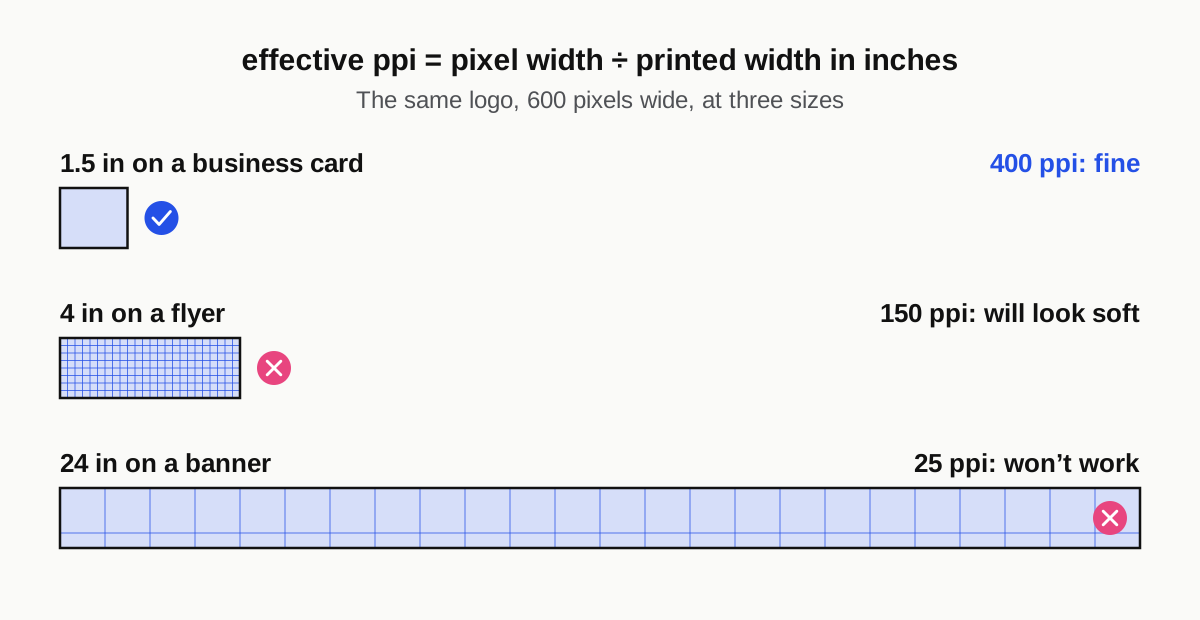
Work out the effective ppi
A logo's resolution only means something at a particular printed size. The calculation is:
effective ppi = pixel width ÷ printed width in inches
Take a logo that's 600 pixels wide:
- printed 1.5 in wide on a business card, it's 400 ppi, which is fine
- printed 4 in wide on a flyer, it's 150 ppi, which will look soft
- printed 24 in wide on a banner, it's 25 ppi, which won't work
For most printed pieces viewed at arm's length, 300 ppi at final size is the target. Large-format pieces viewed from a distance can get away with less.
The ppi number in the file's properties means nothing on its own. A "300 dpi" file that's 300 pixels wide covers one inch of print.
Check what kind of file it really is
Customers often send a file that looks like it should be fine and isn't:
- A PDF, EPS or AI isn't automatically vector. A JPEG placed inside one is still a JPEG. In Illustrator, switch to Outline view: real vector artwork shows as paths, and a placed image shows as an empty box.
- A PNG from a website is usually sized for a screen, often a few hundred pixels wide.
- A social media profile image is small and often heavily compressed.
- A screenshot or a photo of a sign carries the screen's resolution, perspective distortion and lighting.
Zoom to 400% on the edges of the type. Stair-stepped pixels or blocky JPEG artifacts around the letters tell you it's raster, and how badly damaged it is.
Ask the customer for the original first
The fastest fix is finding a better file. Most logos were made by someone, and that someone, or someone they worked with, often still has a vector version. Ask the customer to check:
- Whoever designed the logo: a freelancer, an agency or a logo website. Ask specifically for the AI, EPS, SVG or PDF file.
- Previous printers and sign shops: anyone who made their storefront sign, vehicle lettering, cut vinyl or embroidered shirts needed clean artwork to do it.
- Their web developer: websites often use an SVG logo, which is vector.
- Old email: a search for "logo" plus ".ai", ".eps" or ".svg" in their inbox often turns up the original delivery.
It helps to give your counter staff a sentence to send, something like: "To print your logo sharply at this size, we need the original logo file, usually ending in .ai, .eps, .svg or .pdf. Your designer, sign maker or previous printer may have it. If you can't find it, we can redraw it for you."
That last line matters. It sets up the redraw as a service you offer, not a problem the customer caused.
Option 1: upscaling, and when it works
Upscaling adds pixels by estimating what should go between the existing ones. Photoshop's Preserve Details resampling and dedicated AI upscalers do this better than simple resizing, and in the right situation the result is printable.
Upscaling works reasonably well for:
- photographic or illustrated logos, such as a painted mascot or a photo inside a badge
- textured marks, like distressed, hand-drawn or watercolor styles, where slight softness isn't noticeable
- modest shortfalls, for example an image at 200 ppi that needs to reach 300
- large format seen from a distance, where the viewing distance hides fine detail
It works badly for:
- flat-color logos and text, where edges come out soft or slightly wobbly
- heavily compressed JPEGs, because the artifacts get enlarged along with everything else
- small lettering, where AI upscalers can subtly change letter shapes, which is the last thing a brand needs
Always check an upscaled logo at 100%, and on a printed test if it matters. Edges that look soft on screen look worse on paper.
Option 2: redraw it as vector
For most business logos, which are flat colors, clean shapes and a name in a typeface, redrawing as vector is the right answer. It isn't starting over: the design, proportions and colors stay the same, and the customer should look at the result and see their own logo, only sharp.
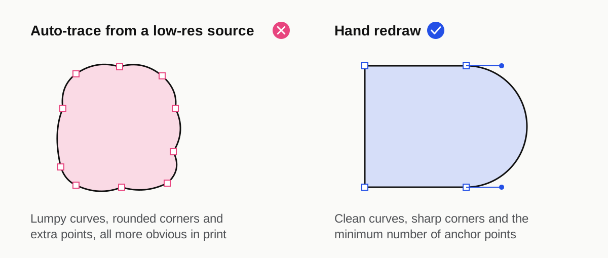
A proper redraw involves:
- Tracing the shapes by hand with clean curves and the minimum number of anchor points.
- Identifying the typeface, or the closest match, and resetting the text rather than tracing blurry letters. Custom lettering is redrawn by hand.
- Matching the colors and defining them as CMYK values, plus spot colors if the customer has brand colors that need to match across jobs.
- Checking it at every size it will be used, from a business card to a banner.
Why auto-trace isn't enough
Illustrator's Image Trace and similar tools are fast, but on a low-resolution source they produce lumpy curves, rounded corners where there should be sharp ones, and letters that drift out of shape. The file is technically vector but looks worse the bigger it prints, and it's harder to edit later. We redraw logos rather than auto-trace them for that reason.
Vector also matters beyond paper. Cut vinyl, screen printing, engraving and embroidery digitizing all work far better from clean vector artwork. If the logo is going on shirts, a clean redraw makes the screen-print separations simpler and the films cleaner.
Option 3: a mix of both
Some logos combine a photographic or illustrated element with a name and tagline. In those cases the best result is often a hybrid: redraw the text and simple shapes as vector, and upscale or retouch only the image part. You get sharp type where it's most noticeable and keep the character of the illustration.
What to give the customer afterward
Once the logo is rebuilt, give the customer a proper set of files: vector AI, EPS, SVG and PDF, plus high-resolution PNGs for web and social use, in CMYK and RGB versions. It solves the problem for their next order with you, and it's often the job that turns a one-time business card customer into one who comes back for signs, flyers and shirts.
It's also worth charging for as its own line item, explained before the job starts.
Quick decision guide
- Customer can find the original vector file: use it.
- Photographic or textured logo, slightly under resolution: upscale carefully and check at 100%.
- Flat-color logo or text, any shortfall: redraw as vector.
- Mixed logo: redraw the type and shapes, upscale the image.
- Tiny screenshot of a complex logo: redraw, and send the customer a proof before using it on anything.
When to send it to us
Logo redraws and low-resolution artwork are some of the most common files we fix for print shops through our prepress and file cleanup service. Send whatever the customer gave you, even a photo of their sign, and it comes back as clean vector artwork under your shop's name, usually the same day. You can see examples of rebuilt artwork in our case studies. To talk it through, book a short call or use the chat on the site.
FAQ
What resolution does a logo need to be for print?
A raster logo needs about 300 ppi at the size it will print, so a logo printed 2 in wide needs to be at least 600 pixels wide. Large-format pieces viewed from a distance can use less. A vector logo has no resolution limit and prints sharply at any size, which is why it's always the better choice.
Can I just change a logo from 72 dpi to 300 dpi?
Not if you only change the number. Changing the dpi without adding pixels just makes the printed size smaller, and adding pixels by resampling only estimates detail that isn't there. That works acceptably for photos with a small shortfall, but flat-color logos and text usually need to be redrawn as vector.
Is auto-tracing a logo good enough for print?
Sometimes, for a simple, high-resolution source, but rarely for a blurry one. Auto-trace on a low-resolution image produces lumpy curves, rounded corners and distorted letters that become more obvious as the print gets larger. A hand redraw takes longer but gives clean artwork that holds up from a business card to a banner.