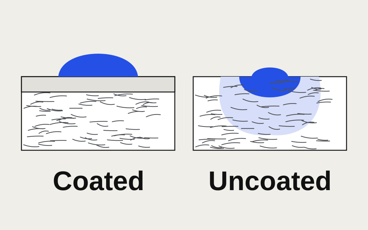
Coated paper has a smooth mineral coating that holds ink on the surface, so colors print brighter, photos look sharper and blacks look deeper. Uncoated paper is porous: ink soaks in and spreads slightly, so the same file prints softer, a little darker in the midtones, and with less contrast. Choose coated (gloss, silk or matte) for photo-heavy pieces and vivid color; choose uncoated for anything people write on, for a natural or premium feel, and for stationery that goes through an office printer. Then set the file up for the paper, because one file rarely looks its best on both.
What the coating actually does
Paper is a mat of fibers. Uncoated paper leaves those fibers exposed, so a drop of ink is drawn into them like water into a towel, spreading slightly as it goes. Coated paper has a layer of clay or similar minerals pressed onto the surface, which fills the gaps between fibers. Ink sits on top and dries there.
Coatings come in a few surface finishes:
- Gloss: shiny, highest contrast and color, more glare. Common for flyers, postcards and catalogs.
- Silk, satin or dull: a low sheen. Most of gloss's color with less glare and easier reading.
- Matte: coated but flat. Colors still hold well; feels smooth rather than papery.
Uncoated papers range from plain offset (everyday text paper) to textured stocks such as linen, felt and laid, and cotton papers for premium cards and invitations.
How the same file prints on each
| Coated | Uncoated | |
|---|---|---|
| Color saturation | High | Lower; strong colors look muted |
| Dot gain (dots spreading) | Lower | Higher; midtones and shadows print darker |
| Sharpness of fine detail | High | Softer; very fine lines and small reversed type fill in sooner |
| Blacks | Deep, especially rich black | Dark gray with a slight warmth |
| Ink limit | Higher (often around 300% or more) | Lower (often in the 260% to 280% range) |
| Drying | Slower on gloss | Faster |
| Writing on it | Gloss smears; matte coated takes some pens | Takes pen and pencil easily |
The ink limits vary by printer, press and profile, so treat those numbers as a guide and use your printer's figure where they give one. Our page on ink coverage being too high explains what the limit is and how to bring a file within it.
Dot gain, in plain words
Every color and photo you print is made of tiny dots. On uncoated paper each dot spreads as it soaks in, so a 50% tint might print looking more like 65% or 70%. The effect is strongest in the middle tones: skin tones go heavier, light tints look darker than on screen, and shadow detail in photos closes up.
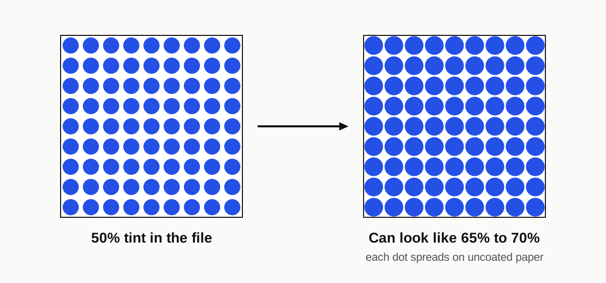
Printers compensate for this with color profiles and plate curves, which is why it's important to tell them, and your designer, which paper the job is on. A file converted for coated stock and printed on uncoated paper usually looks dark and flat.
Pantone colors: C and U
Pantone shows every color twice: once on coated paper (the "C" suffix) and once on uncoated (the "U"). It's the same ink, but the U swatch looks lighter and less saturated, because that's how the ink behaves on uncoated stock.
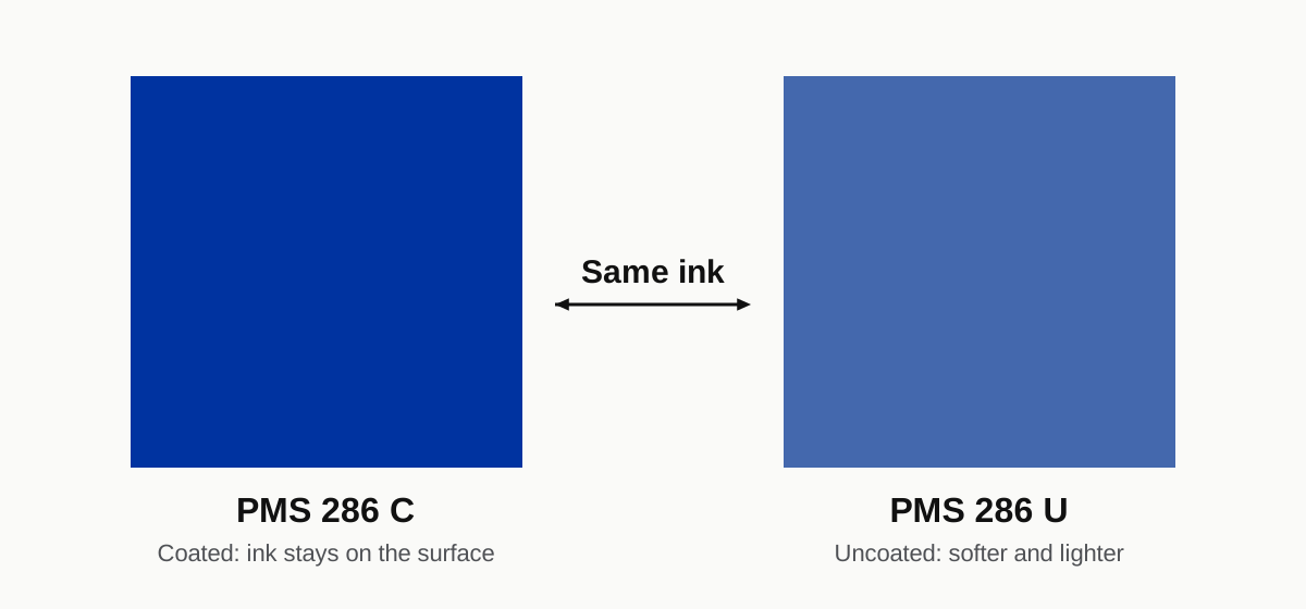
If your brand color looks perfect on a coated business card and disappointing on uncoated letterhead, this is why. Judge each job against the right swatch, and if a brand prints on both papers, accept a visible difference or choose a different U ink that looks closer.
Adjusting a file for uncoated paper
If you know the job is going on uncoated stock:
- Convert with an uncoated profile, or let the printer convert from RGB with theirs. Don't send a file already converted with a coated profile without telling them.
- Lighten photos slightly in the midtones and open up the shadows, so detail survives the dot gain. Check with a printed proof rather than by eye on screen.
- Lower the ink in dark areas. A rich black built for coated stock can exceed an uncoated limit. Typical builds, and when plain black is better, are under rich black.
- Thicken fine lines and avoid tiny reversed text. White type reversed out of a dark background fills in faster on uncoated paper. Keep reversed text above about 8 pt and avoid hairline serifs.
- Don't chase brightness. Neon-bright colors aren't reachable on uncoated stock. Design with that in mind rather than fighting it.
For coated stock, the main risks run the other way: glare on gloss under shop lighting, and fingerprints on dark matte areas, which is why many printers suggest a laminate or varnish for dark designs.
Which to choose for common jobs

- Business cards: both work. Coated (often matte or silk with lamination) for photographic or saturated designs; uncoated or cotton for a tactile, understated card and anything people write a note on. Our business card design work starts by asking which.
- Letterhead and envelopes: uncoated. It takes pen, feeds through office laser and inkjet printers, and coated sheets can smear in some inkjets.
- Flyers and postcards: coated gloss or silk for most marketing; uncoated for a deliberately natural look.
- Brochures and catalogs: coated silk is a common compromise between vivid photos and easy reading.
- Menus: coated with lamination for anything handled at the table; uncoated for printed-daily or disposable menus.
- Notebooks, forms and anything written on: uncoated.
- Packaging: depends on the board, but coated board is common for retail cartons; uncoated kraft is chosen for a natural look and prints much darker.
Finishes and the paper underneath
- Spot UV stands out most against a matte or soft-touch laminated surface. On uncoated stock it tends to soak in and look patchy.
- Foil works on both, though fine foil detail holds better on smooth stock.
- Lamination goes on coated stock routinely; it changes the look (gloss lamination brightens, matte or soft-touch mutes) more than the coating underneath.
- Letterpress and blind deboss look best on soft, thick uncoated or cotton paper, which takes an impression.
Ask for a sample
Paper is easier to choose in the hand than on a spec sheet. Most printers will send sample packs or swatch books for free or at low cost. If you're printing something where the paper matters, such as wedding stationery or premium cards, a printed proof on the actual stock is worth the wait.
If a file was set up for one paper and you're printing on the other, we'll adjust it for a fixed $10.
FAQ
Why do colors look duller on uncoated paper?
Uncoated paper absorbs ink into its fibers, so each dot spreads and the color is partly hidden in the paper. Coated paper keeps the ink on its smooth surface, which reflects more light and keeps colors saturated. The same CMYK values will always look softer on uncoated stock.
Is matte paper coated or uncoated?
Matte paper is usually coated, with a flat rather than shiny finish. It prints colors and photos nearly as well as gloss, without the glare. Uncoated paper also looks matte, but it feels more like plain paper and absorbs more ink.
Can you write on coated paper?
On gloss coated paper, most pens smear or skip. Matte and silk coated papers accept ballpoint and some gel pens. If people need to write on the piece, such as appointment cards, forms or letterhead, uncoated paper is the reliable choice.