Case study · Menus
Shibuya takeaway menu
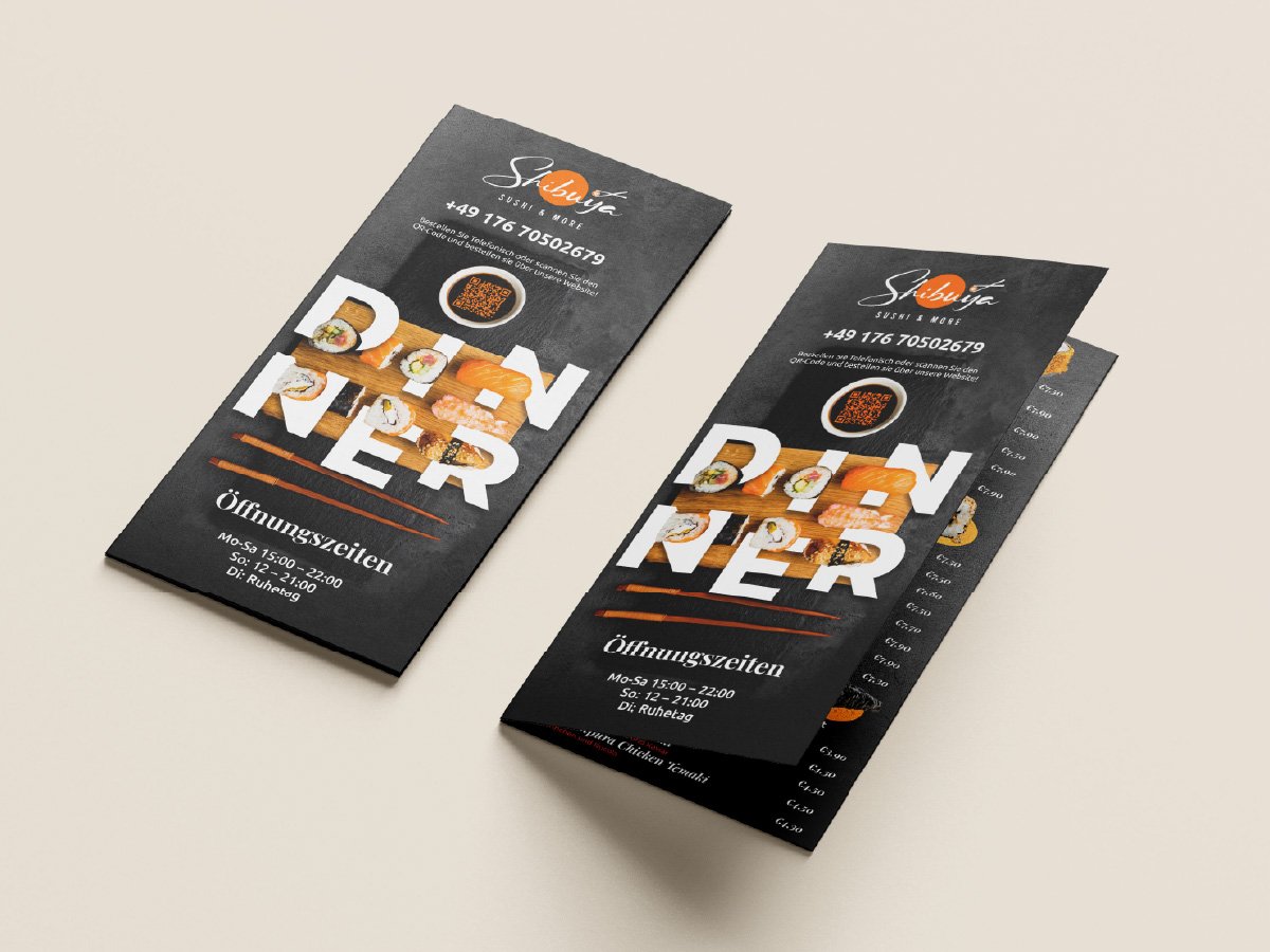
A takeaway menu for a German sushi restaurant. A full carte plus opening hours and contact details, on a folded sheet that has to survive a delivery bag and still sell the food.
What we did
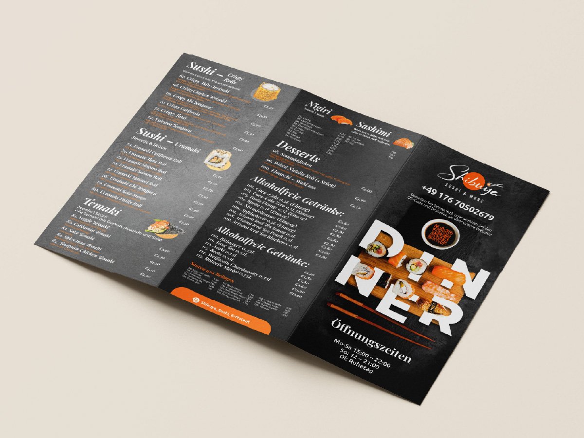
- Built the cover around an oversized DINNER wordmark with the photography masked into the letterforms
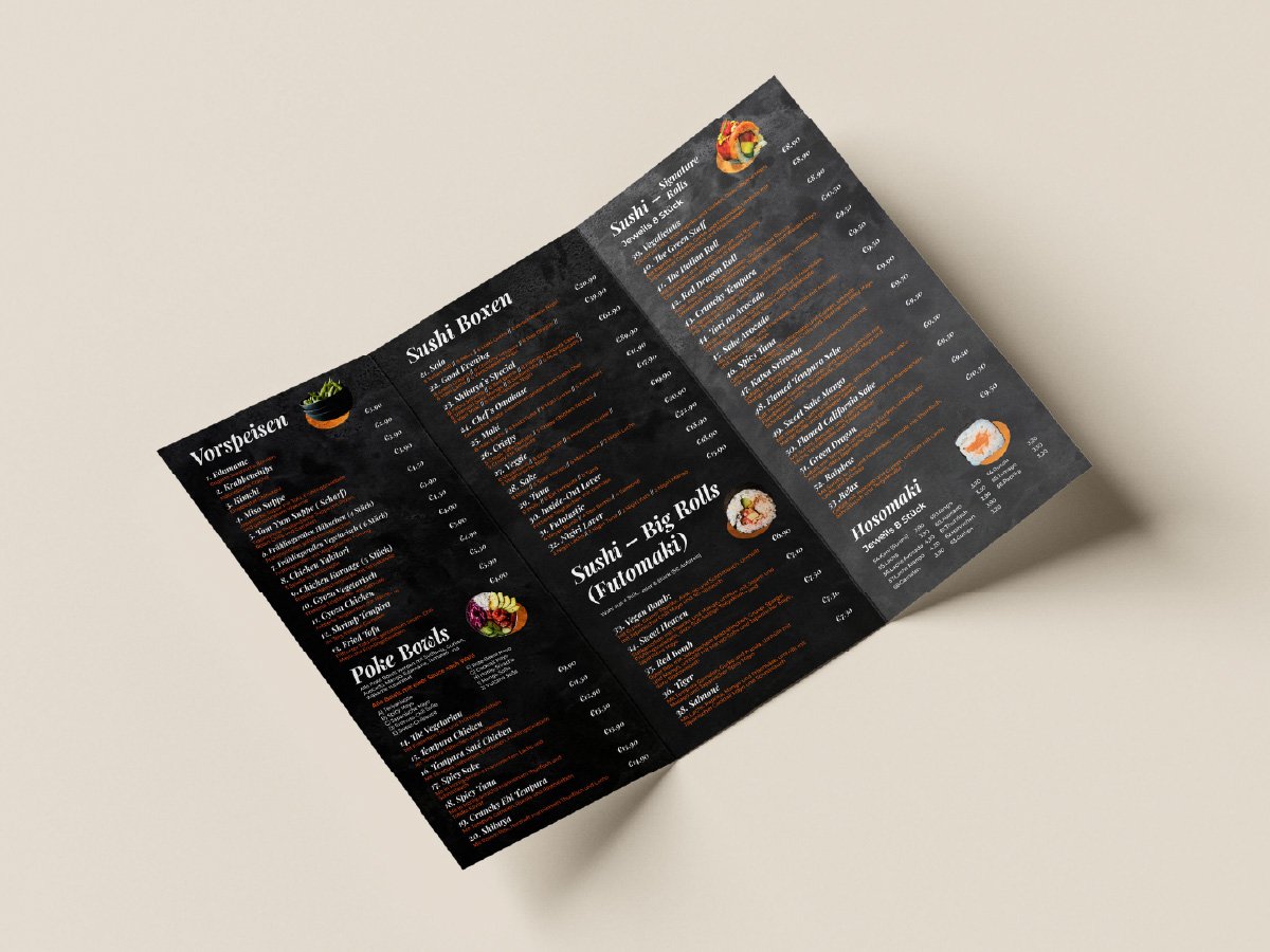
- Held the whole menu on a charcoal ground with a single orange accent, so the food is the only colour
- Used photography sparingly as punctuation between sections rather than one shot per dish
- Set German headings and dish names at menu density with prices scannable down a clean right edge
- Mapped sections to panels so each fold opens on a complete category
- Watched ink coverage and type weight on the dark ground so small text holds rather than filling in
Saffron is dense, photo-heavy and bilingual. Shibuya is restrained and typographic. Same product, same fold, completely different brands. That pair answers the real question behind any portfolio.
Book a 15-minute callThis job is part of our flyers, menus & brochures service for print shops.
More work
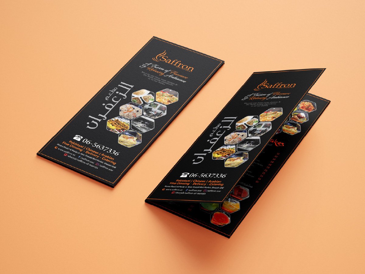 MenusSaffron fold-out menuBilingual multi-panel menu, over a hundred dishes on one folded sheet
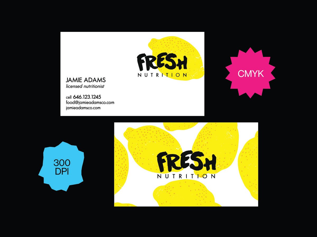 Cards & stationeryFresh Nutrition business cardFull-bleed pattern reverse on uncoated stock, printed
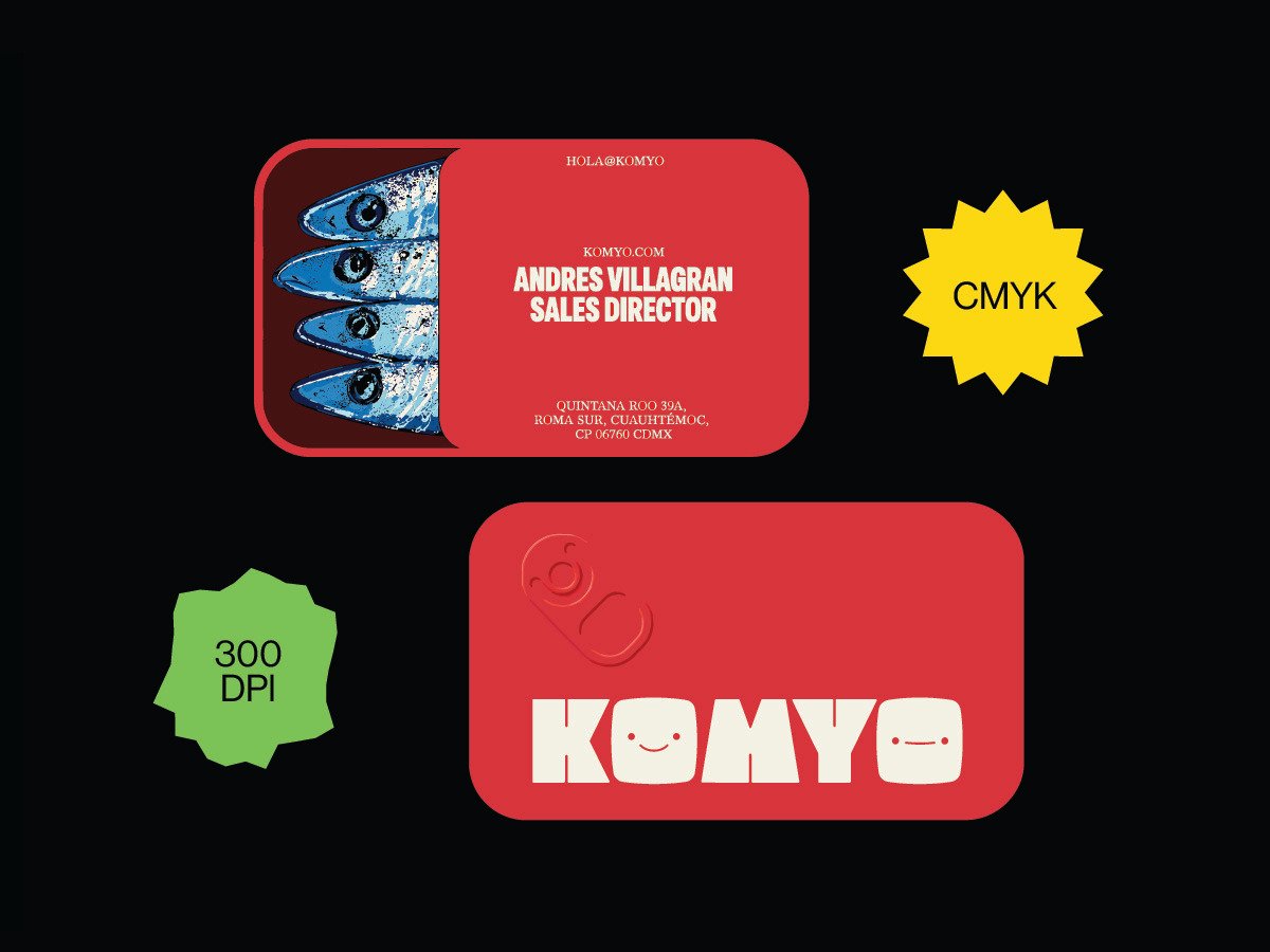 Cards & stationeryKOMYO business cardFile setup through to the printed card in hand
Send us the next job.
One flat monthly fee. Print-ready files in 24 hours, under your name. Pause or cancel anytime.
 Book a call