Case study · Multi-page
Principles of Design calendar
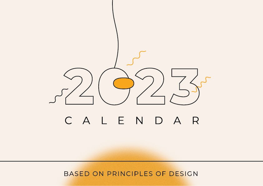
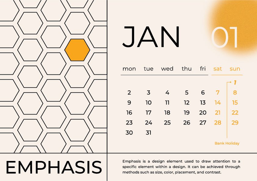
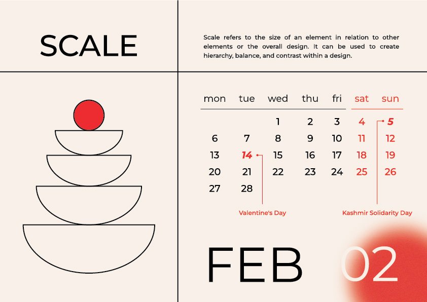
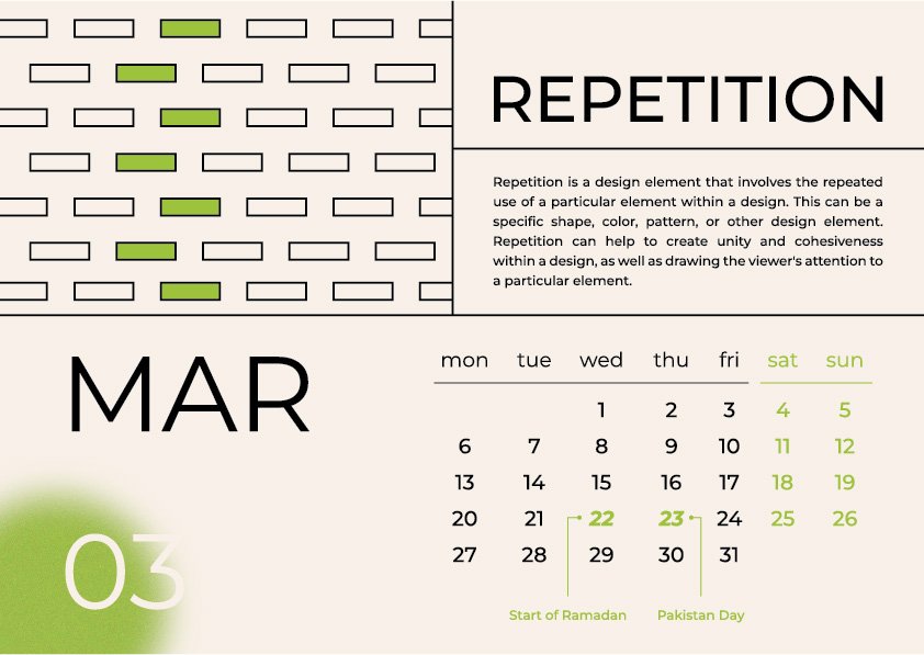
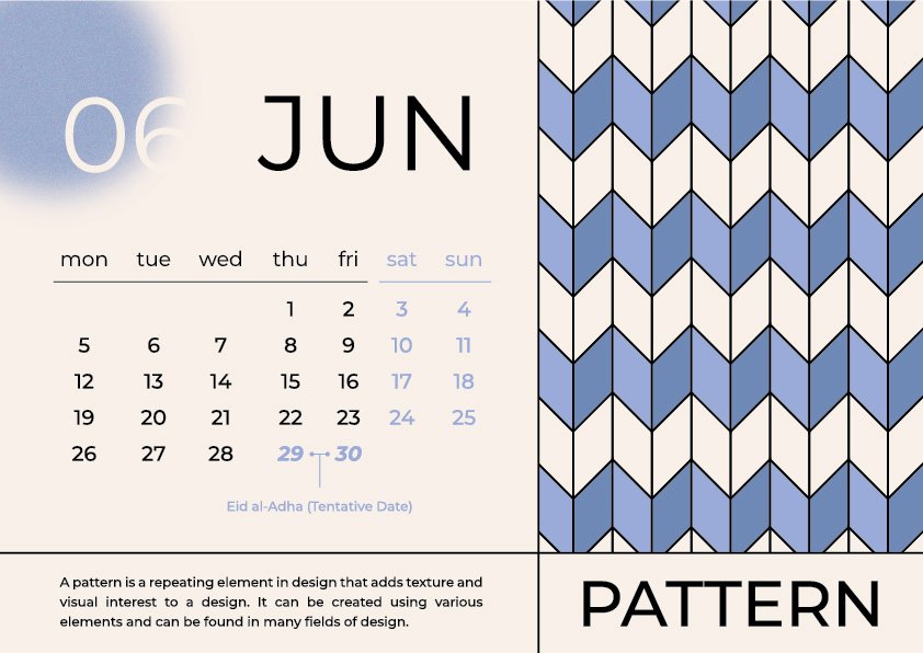
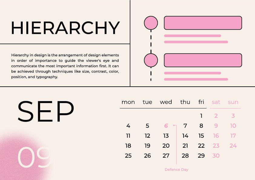
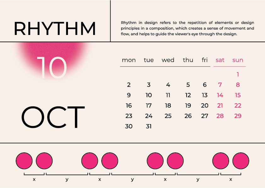
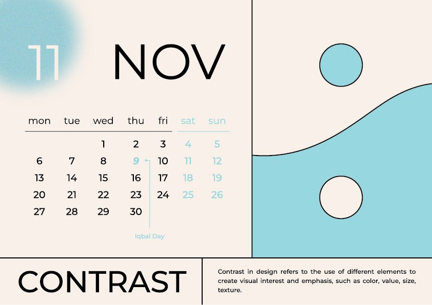
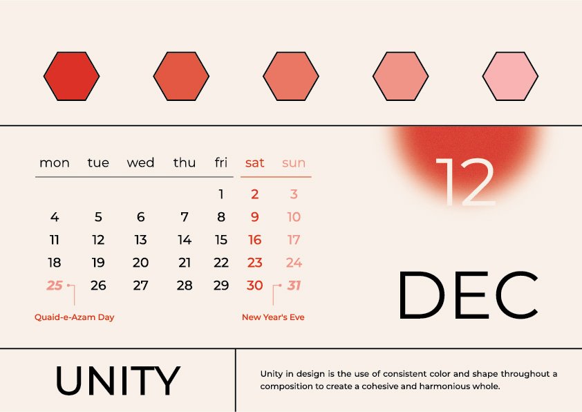
Twelve months, twelve principles of design. Each page does not just name its principle, it demonstrates it. The Repetition page repeats. The Scale page scales. The Space page is mostly empty.




What we did
- Built a single grid that holds all 13 pages: principle name, explanatory paragraph, month number, abstract visual, date grid
- Designed twelve original visuals, each one an illustration of its own principle rather than decoration beside it
- Set one accent colour per month against a warm off-white ground, so the set reads as one series
- Held a consistent typographic hierarchy across every page, so months can be reprinted, reordered or swapped without rebuilding the layout
- Kept the palette restrained enough to print cleanly on uncoated stock, where most calendar designs fall apart
A shop does not sell this calendar once. They sell it to thirty local businesses with the branding swapped each time. That is the template work that makes a retainer pay for itself.
Book a 15-minute callThis job is part of our flyers, menus & brochures service for print shops.
More work
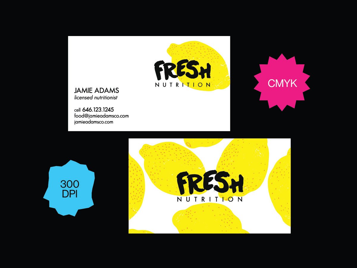 Cards & stationeryFresh Nutrition business cardFull-bleed pattern reverse on uncoated stock, printed
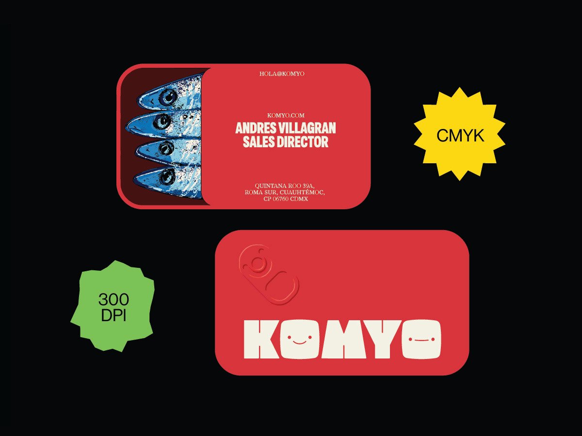 Cards & stationeryKOMYO business cardFile setup through to the printed card in hand
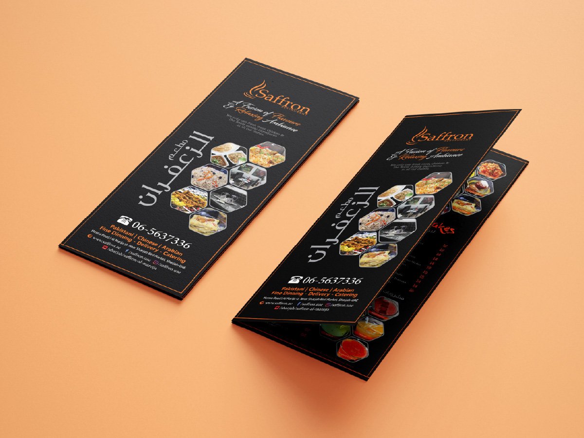 MenusSaffron fold-out menuBilingual multi-panel menu, over a hundred dishes on one folded sheet
Send us the next job.
One flat monthly fee. Print-ready files in 24 hours, under your name. Pause or cancel anytime.
 Book a call